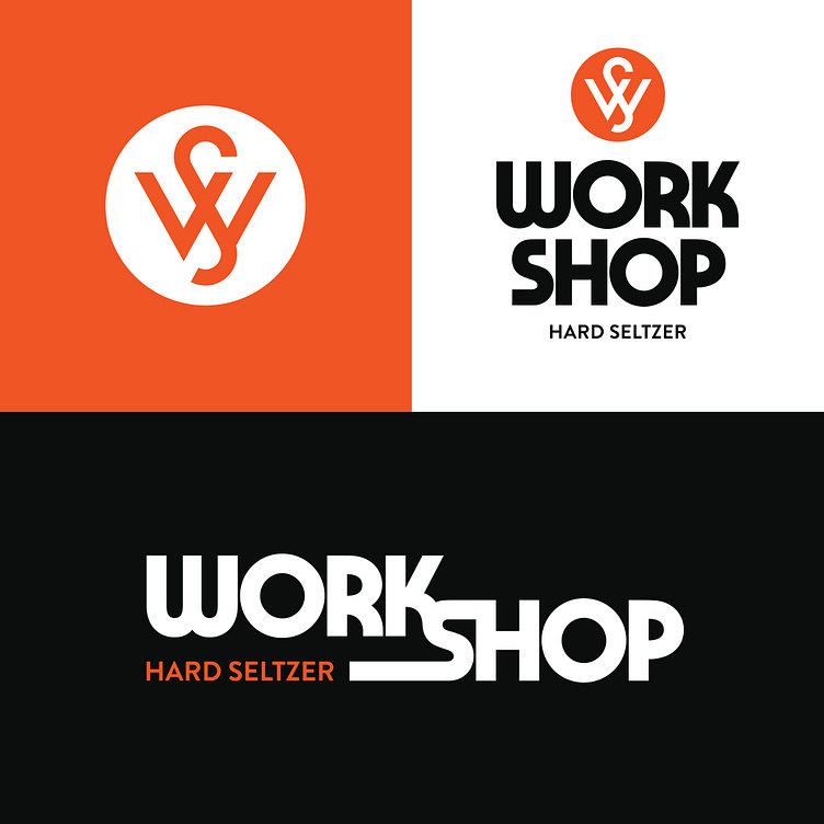
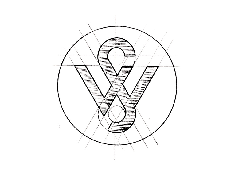
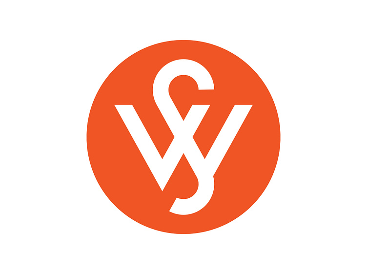
Workshop Logo

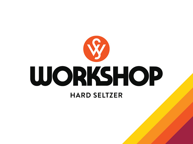
The final brand identity work for Workshop. We landed on a mark that encompasses both the W and S into a clean and simple logo, capable of being able to work on its own or within a full lockup within the system. Its stark symmetry coupled with its subtle breaks gives the logo a point of interest while feeling balanced and grounded. This project took a few rounds to land the plane but couldn’t have asked for a better destination.